Choosing the 2026 season colors for interiors is not just about fashion: it defines how you feel in a room. If you are looking for the perfect color palette for furniture, curtains, and upholstery in Punta Cana, this year the trend points toward the essential, the natural, what endures. At Casa Velura we work with these tones day by day, and here we share how to apply them with criteria in Bavaro, Cap Cana, and La Romana.
2026 season colors for interiors: start with Caribbean light
In Bavaro and Punta Cana the light is abundant and warm. That changes everything. A gray that reads as cold in Madrid becomes a serene neutral here. A beige in Paris might seem dull; under our sun, it comes to life. That is why the renewed neutrals of this year — sands, warm grays, raw tones — work exceptionally well in our region. They enhance natural light without competing with it.
This neutral base creates the perfect stage for other elements — a curtain, an upholstered sofa, a wood — to tell their story without saturating the space.
Curtains and 2026 colors: the perfect filter for the Caribbean ambiance
Curtains are the first visual contact of a space with its environment. For 2026, we bet on:
- Terracotta and ochre in linen or cotton to create immediate warmth. They work spectacularly in living rooms and bedrooms with exterior views, connecting the interior with the Caribbean landscape.
- Off-white, cream, and sand when the priority is spaciousness. They are the safe choice in residences and hotels seeking luminosity without coldness.
- Deep green or burgundy in velvet for spaces that need a mark of distinction. Think of a lobby, a formal dining room, or a master suite where the textile brings controlled drama.
Earthy tones envelop without weighing down. They don't compete with architecture; they complete it. At Casa Velura we manufacture custom curtains with sheer and blackout in Punta Cana that interpret these colors through fabrics designed to resist Caribbean humidity and salinity.
Upholstery and 2026 color palette: where color becomes tactile
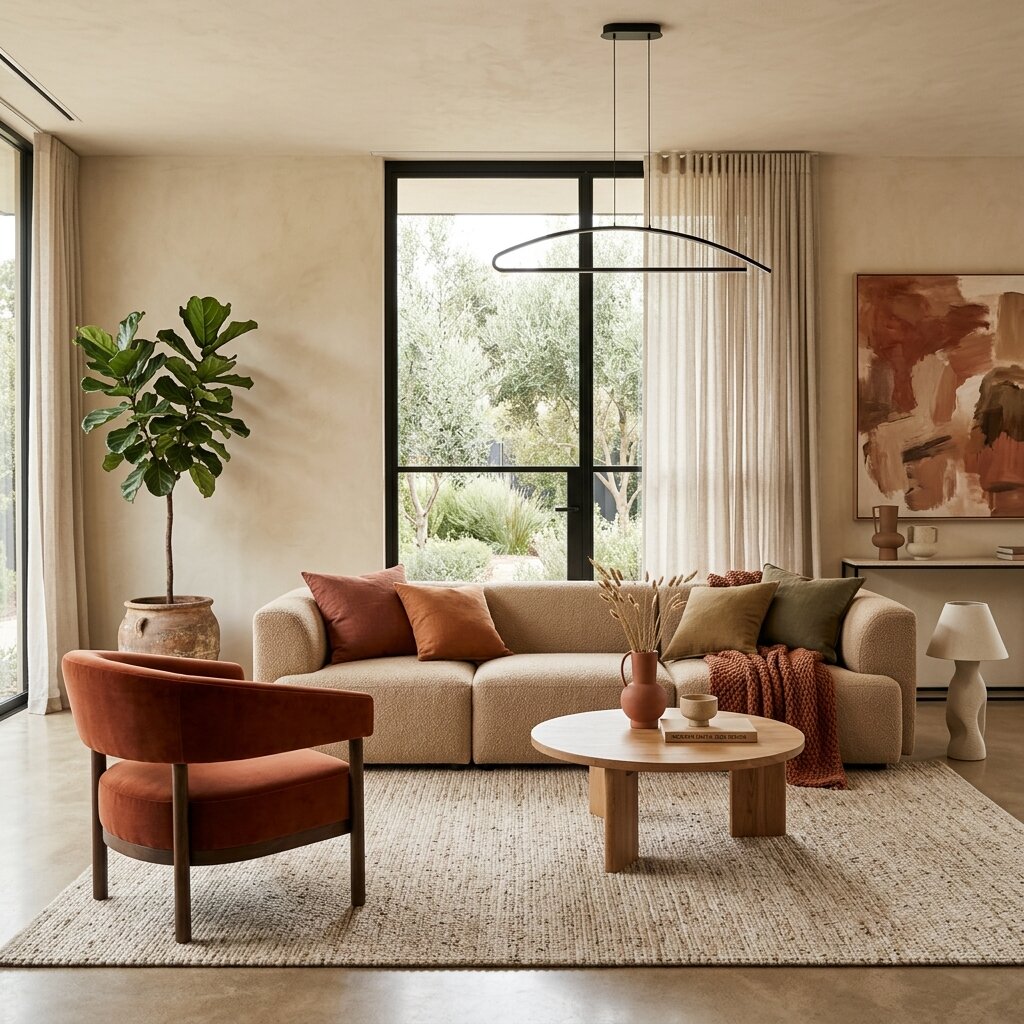
Upholstery is where color becomes a tactile experience. This year, chocolate browns, greige, and clay are our primary recommendation for large pieces: sofas, headboards, armchairs. They convey warmth without saturating, and age better than passing fashion tones. If your current furniture needs renovation, furniture restoration in Punta Cana allows you to change the look without replacing.
Earth tones like terracotta and warm beige on sofas and auxiliary pieces harmonize naturally with the rest of the space. They are colors that don't shout, but they don't go unnoticed either.
For those seeking a point of personality, a sofa in olive green or sage becomes the anchor piece of the space. Combine it with neutrals on walls and accessories, and you will have a balance that doesn't go out of style. Especially powerful in spaces with lots of natural light, where these greens become almost alive.
Want to see how these tones would look in your space?
Request fabric samples with no obligation →The 60-30-10 rule for curtain and furniture tones in the Caribbean
A classic formula that still works, adjusted to our light:
- 60% neutral base tone — walls in raw, sand, or warm gray; wide curtains in beige or off-white. This gives spaciousness and lets the space breathe.
- 30% main earthy color — upholstery in chocolate brown, greige, or clay; rugs in earth tones. Here the personality of the space is built.
- 10% personalized accent — cushions in terracotta, a burgundy armchair, a decorative piece in ochre. The touch that makes the space yours.
In the Caribbean, we recommend keeping the accent close to natural tones. A soft yellow works better than an electric one. A velvet burgundy has more presence than a pure red. The light already provides enough intensity; color must balance, not compete.
Earth tones 2026: the color palette for Caribbean furniture
Terracotta, ochre, and caramel lead the season. Not as occasional accents, but as true protagonists. These tones connect the interior with the exterior landscape — something especially powerful in our region, where tropical vegetation, sand, and reddish earth offer a natural reference palette.
Deep greens — olive, moss — and muted blues — slate, dusty — add sophistication when used with intention. A headboard in moss green, an armchair in slate blue: pieces that anchor the space without weighing it down.
Beyond trends: 2026 season colors that endure
What defines a good interior is not following a palette to the letter, but understanding what the space needs and who inhabits it. At Casa Velura we design each project from that premise: color as a tool, not as an imposition.
The 2026 palette gives us an excellent starting point: neutrals with soul, earth tones with presence, accents with criteria. But the magic is in how we combine them for your specific space — taking into account its solar orientation, architecture, function, and above all, who lives there.
If you are evaluating options for your home, villa, or hotel project in Punta Cana, Bavaro, Cap Cana, or La Romana, we invite you to talk. Together we find the combination that makes a space not only look good, but feel right. And if you are looking for style inspiration, discover how we define Caribbean luxury style in upholstery.
A legacy in every line.